Widget Groups
Widget Groups consist of groups of other widgets.
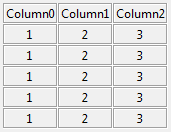
LabelGrid
-
class
groups.LabelGrid(parent, num_of_columns: int, headers: list = None, **options)¶ A table-like display widget.
Parameters: - parent – the tk parent element of this frame
- num_of_columns – the number of columns contained of the grid
- headers – a list containing the names of the column headers
-
add_row(data: list)¶ Add a row of data to the current widget
Parameters: data – a row of data Returns: None
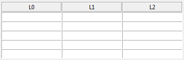
EntryGrid
-
class
groups.EntryGrid(parent, num_of_columns: int, headers: list = None, **options)¶ Add a spreadsheet-like grid of entry widgets.
Parameters: - parent – the tk parent element of this frame
- num_of_columns – the number of columns contained of the grid
- headers – a list containing the names of the column headers
-
add_row(data: list = None)¶ Add a row of data to the current widget, add a <Tab> binding to the last element of the last row, and set the focus at the beginning of the next row.
Parameters: data – a row of data Returns: None
-
read(as_dicts=True)¶ Read the data from the entry fields
Parameters: as_dicts – True if list of dicts required, else False Returns: entries as a dict or table
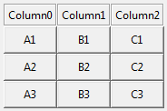
ButtonGrid
-
class
groups.ButtonGrid(parent, num_of_columns: int, headers: list = None, **options)¶ A grid of buttons.
Parameters: - parent – the tk parent element of this frame
- num_of_columns – the number of columns contained of the grid
- headers – a list containing the names of the column headers
-
add_row(data: list, row_label: str = None)¶ Add a row of buttons each with their own callbacks to the current widget. Each element in data will consist of a label and a command. :param data: a list of tuples of the form (‘label’, <callback>) :return: None
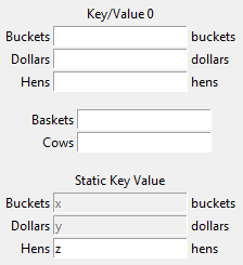
KeyValueEntry
The screenshot consists of three individual examples of KeyValueEntry widgets.
-
class
groups.KeyValueEntry(parent, keys: list, defaults: list = None, unit_labels: list = None, enables: list = None, title: str = None, on_change_callback: callable = None, **options)¶ Creates a key-value input/output frame.
Parameters: - parent – the parent frame
- keys – the keys represented
- defaults – default values for each key
- unit_labels – unit labels for each key (to the right of the value)
- enables – True/False for each key
- title – The title of the block
- on_change_callback – a function callback when any element is changed
- options – frame tk options
-
add_row(key: str, default: str = None, unit_label: str = None, enable: bool = None)¶ Add a single row and re-draw as necessary
Parameters: - key – the name and dict accessor
- default – the default value
- unit_label – the label that should be applied at the right of the entry
- enable – the ‘enabled’ state (defaults to True)
Returns:
-
change_enables(enables_list: list)¶ Enable/disable inputs.
Parameters: enables_list – list containing enables for each key Returns: None
-
get()¶ Retrieve the GUI elements for program use.
Returns: a dictionary containing all of the data from the key/value entries
-
load(data: dict)¶ Load values into the key/values via dict.
Parameters: data – dict containing the key/values that should be inserted Returns: None
-
reset()¶ Clears all entries.
Returns: None
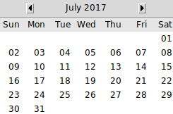
Calendar
-
class
groups.Calendar(parent, callback: callable = None, year: int = None, month: int = None, day: int = None, **kwargs)¶ Graphical date selection widget, with callbacks. To change the language, use the
localelibrary with the appropriate settings for the target language. For instance, to display theCalendarwidget in German, you might use:locale.setlocale(locale.LC_ALL, 'deu_deu')
Parameters: - parent – the parent frame
- callback – the callable to be executed on selection
- year – the year as an integer, i.e. 2020
- month – the month as an integer; not zero-indexed; i.e.
“1” will translate to “January” :param day: the day as an integer; not zero-indexed :param kwargs: tkinter.frame keyword arguments
-
add_callback(callback: callable)¶ Adds a callback to call when the user clicks on a date
Parameters: callback – a callable function Returns: None
-
class
datetime(year, month, day[, hour[, minute[, second[, microsecond[, tzinfo]]]]])¶ The year, month and day arguments are required. tzinfo may be None, or an instance of a tzinfo subclass. The remaining arguments may be ints.
-
astimezone()¶ tz -> convert to local time in new timezone tz
-
combine()¶ date, time -> datetime with same date and time fields
-
ctime()¶ Return ctime() style string.
-
date()¶ Return date object with same year, month and day.
-
dst()¶ Return self.tzinfo.dst(self).
-
fromisoformat()¶ string -> datetime from datetime.isoformat() output
-
fromtimestamp()¶ timestamp[, tz] -> tz’s local time from POSIX timestamp.
-
isoformat()¶ [sep] -> string in ISO 8601 format, YYYY-MM-DDT[HH[:MM[:SS[.mmm[uuu]]]]][+HH:MM]. sep is used to separate the year from the time, and defaults to ‘T’. timespec specifies what components of the time to include (allowed values are ‘auto’, ‘hours’, ‘minutes’, ‘seconds’, ‘milliseconds’, and ‘microseconds’).
-
now()¶ Returns new datetime object representing current time local to tz.
- tz
- Timezone object.
If no tz is specified, uses local timezone.
-
replace()¶ Return datetime with new specified fields.
-
strptime()¶ string, format -> new datetime parsed from a string (like time.strptime()).
-
time()¶ Return time object with same time but with tzinfo=None.
-
timestamp()¶ Return POSIX timestamp as float.
-
timetuple()¶ Return time tuple, compatible with time.localtime().
-
timetz()¶ Return time object with same time and tzinfo.
-
tzname()¶ Return self.tzinfo.tzname(self).
-
utcfromtimestamp()¶ Construct a naive UTC datetime from a POSIX timestamp.
-
utcnow()¶ Return a new datetime representing UTC day and time.
-
utcoffset()¶ Return self.tzinfo.utcoffset(self).
-
utctimetuple()¶ Return UTC time tuple, compatible with time.localtime().
-
-
selection¶ Return a datetime representing the current selected date.
-
class
timedelta¶ Difference between two datetime values.
timedelta(days=0, seconds=0, microseconds=0, milliseconds=0, minutes=0, hours=0, weeks=0)
All arguments are optional and default to 0. Arguments may be integers or floats, and may be positive or negative.
-
days¶ Number of days.
-
microseconds¶ Number of microseconds (>= 0 and less than 1 second).
-
seconds¶ Number of seconds (>= 0 and less than 1 day).
-
total_seconds()¶ Total seconds in the duration.
-
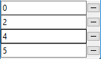
MultiSlotFrame
-
class
groups.MultiSlotFrame(parent, columns: int = 1)¶ Can hold several removable elements, such as a list of files, directories, or a checklist.:
# create and grid the frame
msf = tk_tools.MultiSlotFrame(root)
msf.grid()

# add some items
msf.add('item 1')
msf.add('item 2')

# get any user-entered or modified values
print(msf.get())
Parameters: - parent – the tk parent frame
- columns – the number of user columns (defaults to 1)
-
add(string: (<class 'str'>, <class 'list'>))¶ Add a new slot to the multi-frame containing the string. :param string: a string to insert :return: None
-
clear()¶ Clear out the multi-frame :return:
-
get()¶ Retrieve and return the values in the multi-frame :return: A list of values containing the contents of the GUI
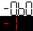
SevenSegment
-
class
groups.SevenSegment(parent, height: int = 50, digit_color='black', background='white')¶ Creates a single seven-segment display which may be used to emulate a numeric display of old:
# create and grid the frame
ss = tk_tools.SevenSegment(root)
ss.grid()

# set the value
ss.set_value(2)

# set the value with a period
ss.set_value(6.0)
Parameters: - parent – the tk parent frame
- height – the widget height (defaults to 50)
- digit_color – the digit color (ex: ‘black’, ‘#ff0000’)
- background – the background color (ex: ‘black’, ‘#ff0000’)
-
class
groups.SevenSegmentDigits(parent, digits: int = 1, height: int = 50, digit_color='black', background='white')¶ Creates a single seven-segment display which may be used to emulate a numeric display of old:
# create and grid the frame
ss = tk_tools.SevenSegment(root)
ss.grid()

# set the value
ss.set_value(2)

# set the value with a period
ss.set_value(6.0)
Parameters: - parent – the tk parent frame
- height – the widget height (defaults to 50)
- digit_color – the digit color (ex: ‘black’, ‘#ff0000’)
- background – the background color (ex: ‘black’, ‘#ff0000’)